MythTV has a very robust graphical user interface engine. This engine can use various configuration files and graphical image files to display the interface elements to the user in unique ways. The collection of images and config files is called a theme. This document will assist you in creating a brand new theme to make a new look and feel to the MythTV frontend.
Each theme's files are collected together into one directory that is installed (by default) into /usr/local/share/mythtv/themes/. In this directory there should be at least three text files and a large number of graphics files. The three main text files are theme.xml, qtlook.txt, and ui.xml.
Before altering any of the files, it helps to first construct a concept image in GIMP or Photoshop, with liberal use of layers for different elements. Create a base image of size 800x600 that is your background. On top of this start laying out your basic design. Separating the elements you add into layers help later on when you need to save out each element in an individual graphic file. You can simply copy the contents of that layer and create a new image for it. For example, create your button image in a separate layer that is simply overlayed over the background so you can easily move it around and change it without affecting the background.
The basic main menu theme is driven by the theme.xml file. This file allows you to define a background image, title images, a generic button look, a logo, up and down arrows, and more specific behavior for buttons to display a "watermark" image on the screen when that button is selected. This last item, for example, will allow you to put up a picture of a radio or speaker when the "Music" menu item is highlighted.
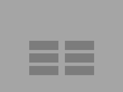
Start with your concept background image and add a layer for buttons. First just make rectangles and lay them out in an area on the screen. In this example image, the light grey is the background image, and the darker grey rectangles are the buttons.
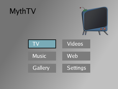
Now add a logo to the image, and perhaps make a new layer with an "active" button over one of the existing buttons to show what a button would look like if it's selected. Also add text for the buttons, and decide what color you want the button text, and if you want a drop-shadow or outline around the text. You can also place images that are switched based on the button that is selected. For example, you can have an image of a television set that is displayed when the "TV" button is highlighted (this is called the "watermark"). You may also use transparency as the final elements will be saved as PNG files.
For the theme.xml file, you'll need to save out several image as PNG format. Using each layer and selecting just the element you want to save out, save the following in separate PNG files. Click on the example link for the actual image element saved out in this tutorial example.
<background style="normal">
    <image>background.png</image>
    <buttonarea>260,272,281,210</buttonarea>
    <visiblerowlimit>3</visiblerowlimit>
</background>
Above is the background tag. The buttonarea tag defines
the region where the buttons will appear. Use your
image editing program (GIMP) to find the start location and width,height of the
region in which your buttons appear. The format of the buttonarea tag is
startx,starty,width,height. The visiblerowlimit defines the maximum number of
button rows that will appear on the screen before the arrow images are used to
indicate the user may scroll down to see more buttons.
<genericbutton>
    <watermarkposition>550,200</watermarkposition>
    <normal>button.png</normal>
    <active>button_active.png</active>
    <text>
         <area>12,6,0,0</area>
         <color>#C0C0C0</color>
         <fontname>Arial</fontname>
         <fontsize>18</fontsize>
         <bold>yes</bold>
         <outline>
           <color>#404040</color>
           <size>2</size>
         </outline>
    </text>
</genericbutton>
The genericbutton tag defines the buttons arranged on the menu screen.
The watermarkposition defines the place on the screen where the
upper-left corner of the watermark image will appear.
The normal and active tags are used to specify the images for
the inactive and active buttons. The text tag defines the text
attributes for the button labels. You'll most likely want to
change the color and outline color of the text to suit your theme.
<logo>
    <image>mythtv_logo.png</image>
    <position>270,40</position>
</logo>
The logo tag defines the image and position for the logo.
The position is the upper-left corner location.
<uparrow>
    <image>arrow_up.png</image>
    <position>260,251</position>
</uparrow>
The uparrow and downarrow sections are used to define which image to
use and where to place it in case there are more buttons available than
can fit in the buttonarea you have defined (see the background tag).
If there are more buttons available on a given menu screen, the down arrow
and up arrow will be shown as appropriate to let the user know there are
more buttons. The user can simply move down past the last button to access
the new buttons.
<buttondef name="TV">
    <image>text-blank.png</image>
    <watermarkimage>watermark_tv.png</watermarkimage>
    <offset>0,0</offset>
</buttondef>
There are a whole bunch of these buttondef tags. There is one for each
button on all of the menu screens. This is where you tie up each watermark
image with the appropriate button. The name of the buttondef should be
pretty obvious as to which button it represents.
This section shows how to customize the artwork on various list screens, such as the "Watch Recordings", "Delete Recordings", and "Resolve Conflicts" screens.
On various screens that show lists of programs, there is artwork that can be used to create a frame around the selections and lists. These images are specified in the file ui.xml. This file is somewhat complex, and editing it should only be done after a thourough scan of the file and you understand what sections do what.
Here are the images we care about:
The big-singleframe.png file is used in the conflict screen. This screen presents the user with a list of future recordings and highlights conflicting scheduled shows.
The finder-frame.png file is used in the programfind screen. This screen is used in the Program Finder option off of Scheduled Recordings.
The reallybig-singleframe.png file is used in the rankchannels and rankprograms screens. These are used on the screens where you can adjust channel recording priorities. It is also used in the programlist screen.
The showing-frame.png file is used on the playback screen. This is shown on the Watch Recording screen where you can browse the programs that have been recorded.
This section shows how to change colors throughout the frontend such as in dialog boxes, lists, and other text elements. TODO
This section shows how to alter the layout of various screens using more advanced techniques. Altering ui.xml is not for the faint of heart. TODO